

Mastering React Styling: From Vanilla CSS to Advanced Libraries
Exploring Different Approaches to Styling React Applications: From Vanilla CSS to Styled Components


Photo by Nangialai Stoman on Unsplash
Styling react applications can be a daunting task, especially for beginners. There are many different options to choose from, such as Vanilla CSS, CSS modules, Sass, Styled Components, Tailwind CSS, and many more.
Let’s break down some of these to understand and determine which one suits your needs the best.
Vanilla CSS
This is just plain CSS, the standard styling language for web documents.
It offers simplicity and performance benefits due to the absence of tooling, and modern CSS features like CSS Custom Properties can replace some traditional preprocessor functions.
However, its global nature can lead to styling conflicts. Modern component-based architectures apply styles at the component level rather than at the global level. In other words, each component will be styled using its own CSS file.
Take a look at the following example that uses vanilla CSS.
//App.js
import Child1 from "./components/Child1";
import Child2 from "./components/Child2";

export default function App() {
  return (
    <div className="App">
      <h1>CSS global issue</h1>
      <Child1 />
      <Child2 />
    </div>
  );
}
//Child 1
import React from "react";
import "./child1.css";
export default function Child1() {
  return (
    <div className="container1">
      <div className="child">Component with styles imported</div>
    </div>
  );
}
/* target child class inside child1 and apply styles */
.child {
  width: 50%;
  height: 100px;
  border: 3px solid #2563eb;
  background-color: aliceblue;
  border-radius: 10px;
  margin: 20px auto;
  display: flex;
  align-items: center;
  justify-content: center;
}
//Child2
import React from "react";
export default function Child2() {
  return (
    <div className="container2">
      <div className="child">Component without styles imported</div>
    </div>
  );
}
As you can see, It has a parent App.js component and two child components. The Child1 component has styles applied, but the Child2 does not.
However, when it is rendered on a browser, styles are applied to both children.
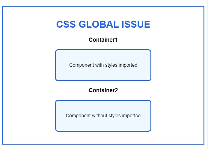
How is it possible that styles applied in the Child1 component also affect the Child2 component?
When a CSS file is imported into a component, it is not limited to that component only. Instead, it is applied globally to all elements of the webpage. So, if you create a new component with the same class name, the styles will be applied to that component as well.
How to fix it?
You can fix it in a couple of ways.
Using strict naming conventions like BEM. But, there are some downsides. BEM can make HTML look cluttered with lengthy class names. It's also tough for beginners to learn and can make styles overly specific, which makes it tricky to change them later.
An alternative approach is to use tools such as CSS modules and styled components.
CSS Modules
A CSS Module is a tool that allows you to write vanilla CSS, and import it into a JS file. This means the styles you define in a module are not global and won’t conflict with styles in other CSS files.
To see the difference, you need to comment out the third line and uncomment the fifth line in the below sandbox.
As you can see, the styles are applied only to the container1 child. If you inspect container 1 on dev tools, you will find a different class name.
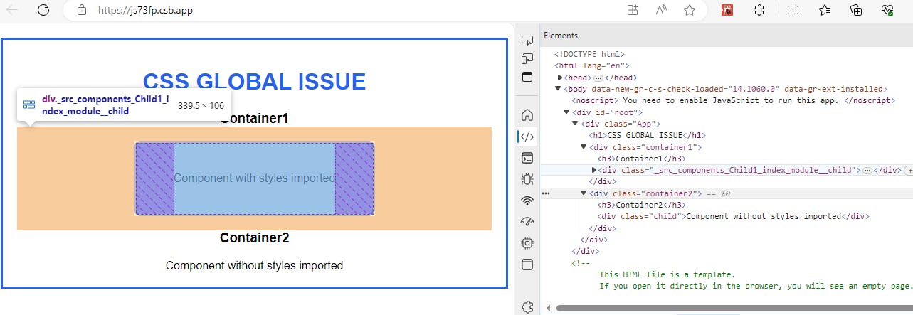
CSS Modules generate unique class names by appending a hash to the original class name. This process occurs during the build time of your application. When you write your CSS, you use standard class names, but the build tool (like Vite or webpack) transforms these into unique identifiers.
This allows you to use common class names in your CSS files without worrying about naming collisions across your project.
Pros:
Ensures unique class names for scoping and specificity (e.g.,
.wrapper-abc123).Offers a familiar writing process similar to standard CSS.
Includes a
composesfeature to extend CSS classes.
Cons:
Lacks modern features like auto prefixing.
Difficult to share data between CSS and JavaScript.
Sass/Less
Sass is a CSS preprocessor that allows you to write CSS in a programming construct with variables, nested rules, mixins, functions, and more, which will then be compiled into regular CSS, operating similarly to TypeScript. All valid CSS is also a valid Sass and Sass compiles to CSS at the build time just like typescript compiles to JS.
In the CSS module example, we only styled the child component inside container1. To style the container as well, we need to modify the CSS code as follows.
.container1{
   padding: 25px 15px;
   border:5px dotted #2563eb;
   border-radius:10px;
}
.child {
    border:3px solid #2563eb;
    border-radius:10px;
    /*...Other Child style goes here*/
 }
Note that we have used the same code to apply border styles to both the parent and child elements. While this works well for small applications, it can become difficult to manage as the application scales up.
To address this issue, we can take advantage of Sass nesting and variables. This will allow us to define styles for child elements within the context of their parent's style rule. This approach not only enhances readability but also makes it easier to maintain the code in the long run.
// Define variables for repeated values
$border-color: #2563eb;
$background-color: aliceblue;
$border-radius: 10px;

// Use nesting to scope styles to specific components
.container1 {
   padding: 25px 15px;
   border:5px dotted $border-color;
   border-radius:$border-radius;
      .child {
        border: 3px solid $border-color;
        background-color: $background-color;
        border-radius: $border-radius;
        /* ...Other Child style goes here */
      }
}
Pros:
Variables: Sass allows you to use variables to store values that you can reuse throughout your stylesheet.
Nesting: Sass lets you nest your CSS selectors in a way that follows the same visual hierarchy of your HTML.
Mixins: You can create reusable pieces of CSS that can be included in other selectors.
Cons:
Build Tool Requirements: It requires additional build steps to compile SCSS to CSS.
Globally Scoped: It is also global in nature and not scoped to a specific component. It leads to unintended side effects across components. This can be fixed by combining SCSS with CSS modules.
In the context of React applications, using SCSS with CSS Modules can greatly enhance the developer experience by providing a structured and organized way to style components, ensuring that styles do not leak across component boundaries.
Styled Components
Styled Components is a super cool CSS-in-JS library that makes styling React and React Native components way easier. It uses tagged template literals to encapsulate styles at the component level, which is way better than traditional CSS. With Styled Components, you can avoid problems like global namespace, dependency management, dead code elimination, and more.
Let's rewrite the child component in our example code using Styled Components to better understand it.
// Styled components for container1 and child
import styled from 'styled-components';

const Container = styled.div`
   padding: 25px 15px;
   border:5px dotted #2563eb;
   border-radius:10px;
`;

const StyledChild = styled.div`
  width: 50%;
  height: 100px;
  border: 3px solid #2563eb;
  background-color: aliceblue;
  border-radius: 10px;
  margin: 20px auto;
  display: flex;
  align-items: center;
  justify-content: center;
`;

// Child1 component with StyledChild
export default function Child1() {
  return (
    <Container>
      <StyledChild>Component with styles imported</StyledChild>
    </Container>
  );
}
Pros:
Scoped Styles: Styles are scoped to the components, not affecting other elements globally.
Dynamic Styling: Easily adapt styles based on props or a global theme.
Maintenance: Simplifies maintenance by co-locating styles with their components.
No Class Name Bugs: Eliminates the possibility of class name conflicts.
Automatic Vendor Prefixing: Styles are automatically vendor-prefixed.
Best in class performance: It offers superior performance compared to the other tools in its category.
Cons:
Framework Dependency: Tied to JavaScript, limiting use outside React.
Readability Issues: CSS mixed with JS can affect clarity.
Runtime Overhead: Runtime compilation can impact performance.
Build Tool Requirements: May need additional tools and setup.
Tailwind CSS:
Tailwind CSS is a utility-first CSS framework that enables fast and efficient UI development. It has predefined classes that allow specific styles to be applied directly to HTML markup, reducing the need for custom CSS and streamlining development.
Our Child1 component can be written in CSS as follows.
// Child1 component with Tailwind CSS
export default function Child1() {
  return (
    <div className="container1">
      <div className="child bg-aliceblue border-3 border-blue-600 rounded-lg mx-auto my-5 p-4 flex items-center justify-center" style={{ width: '50%', height: '100px' }}>
        Component with styles imported
      </div>
    </div>
  );
}
Pros:
Rapid Prototyping: Tailwind’s utility classes make it quick and easy to prototype designs.
Maintainability: It encourages consistency across designs with a set of predefined utility classes.
Customization: Tailwind can be customized to fit the design needs of your project.
Responsiveness: Tailwind includes responsive variants for every utility, making it easy to build responsive designs.
Cons:
Verbose HTML: Your markup can become cluttered with many utility classes.
Learning Curve: There’s a learning curve to memorize the utility classes.
Over-reliance on Utility Classes: It can lead to less use of CSS’s powerful features like pseudo-classes and animations.
Some devs use both Tailwind CSS and Styled Components together. This way, you can make your UI look great in less time. Just remember, there's no single solution for everyone. You gotta find what works for you and your team.
If you've reached this point, thank you very much. I hope that this article has been helpful to you and I'll see you all in the next.